http://www.wix.com/mlenti/mlenti
My concentration is the exploration of texuture through different foods. I experiment with different matierals and layouts.
Thursday, October 6, 2011
ARCHITECUTRE
Well here is a link to my architecture e-portfolio. If any of you high school chaps are interested in architecture take a look at it! Surprisingly it involves a ton of art. My e-portfolio has all of my sketches and projects from my architecture 101 class.
Sunday, May 8, 2011
Thursday, March 17, 2011
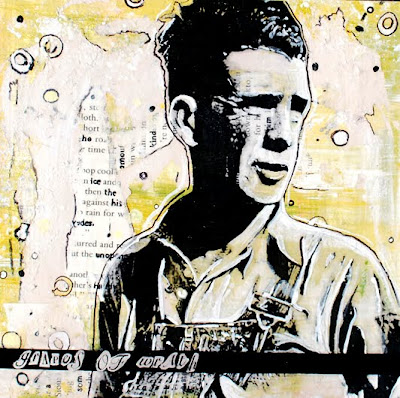
Tom Joad
Onward to Cali
Corn

My inspiration for this piece actually came from a book I was reading in English class, Grapes of Wrath. The book is about a family who is forced off of their land during the dust bowl because the banks are revoking their land. There is a lot of images of corn fields in the book and I drew inspiration from this. The hardest part of this was trying to get the kernels how I wanted them, and I'm also dissapointed the text underneath the corn was covered up. I was hoping to have some of the text showing through the corn.
Oranges
Carrots
Cotton Candy
Tuesday, January 11, 2011
Frappuccinos

This is yet another contiuation of my concentration of texture created with acrylic paint. I really like the background on this piece as well as the composition of all 4 frappuccinos (2x2). The texture I was really trying to focus on was the whipped cream and the frappuccinos mixture inside of the glass. However I do wish to revisit this piece because I do no think that the upper right green frappuccino has the right coloring to fit correctly in this piece. I want to go back and repaint it. On the other hand my favorite is the bottom left brown frappuccino, I think the highlights look the most realistic and that the mixture inside fo the glass looks the smoothest in comparison to the rest.
Subscribe to:
Posts (Atom)


