Thursday, December 2, 2010

Muffin


This is my second independent piece and it follows very closely to my Go Bananas and Ice-Cream pieces. I tried to work with acrylic paint to create texture in the muffin, like I did with the ice-cream cone. I did repeating typography as well. With this composition, I placed the muffin more towards the top rather than dead center. I am also experimenting with some different compositional choices, such as the placement of the muffin.

Ice-Cream


This was one of my most sucessful pieces in my opinion. I really really like the background on this one. I deffinately did a lot of work with it, and I did some experimentation with india ink and tissue paper to create a cool effect. The ice-cream cone came out suprisingly well! However, I am not too thrilled with th lack of detail and color unity of the actual cone. I like the texture of the ice-cream and I want to contiune to work on creating texture in my future pieces.

GO BANANAS

I really loved creating this piece! I took a page out of my altered book and then further developed it to create the three repeating bananas. I used sharpie for the typography and acrylic paint for the actual bananas. My favorite part would have to be the marbled paper I used on the inside of the banana peel. I also enjoyed creating the typography in the background to tie all 3 panels together.


Tuesday, October 19, 2010

Inspire


I will eventually put up the picture of the final woven piece I did, however I could not find it in Brandt's art gallery. Anyway I love painting these fish! Especially the red one, the blue one was rushed and I did not get to put the time and effort I wanted in it. I liked the subject matter and the contrasting hot and cool colors. The actual weaving of the piece was difficult, but I had a cool effect in the end.


Green with Envy


I was inspired by Francis Bacon for this piece. He creates distorted faces and paints them with unique colors. I took a picture of myself and distorted it in photoshop, copied the image onto masonite, and then painted it with acrylic. I liked the risk I took in this, the idea is very abstract and I am not used to disorting things. I like the colors, and the envious look in the face. Overall I think I was sucessful at experimenting with the idea.

Stagelights

I'm really not a big fan of this at all! I used a lot of found papers to create a unique surface to draw on, so unique that I could barely draw on it with my charcoal. I had to resort to using india ink. The subject matter of the stagelights are also very vauge making it hard to determine what they are. However I did experiment with some encaustic wax on top. Least favorite of the year.

Homework Overload


This piece is a very lose interpretation of a figure drawing. I actually drew this figure from a physical model. I used sticks to draw with india ink, and soft pastel for the color outline. I like all the energy in the picture with teh ink splatters and the lines that move all across the body. This piece was a fun to create, and I would like ot make more like it.

Monday, September 13, 2010

Cathedral Study


This is one of the pieces I made over the summer. I had the most fun doing this piece because I really enjoyed re-creating the subject. I'm looking to do architecture in the future, and the photograph of this cathedral sparked my interest because it protrayed such an interesting architecture structure. I used charcoal and a blue prisma color.

Shipwreck


I used charcoal and watercolor in this piece, and I experimented with a new erasure technique. I wanted to show the movement of a small boat through the ocean. I think that the picture came out well overall, but I think I could have picked a better boat. The boat I drew from obsevation was not very detailed, it was very simple and I think that the piece would have been stronger with a more intense boat. I like the colors though :)

Wednesday, May 19, 2010

Seaside


This has to be my favorite piece all semester. I really got into my subject of the shell and drift wood for this piece. In my opinion the best part of this is the white hightlight on the shell and how the background looks like wood. For my background I used different textured/colored paper glued together, and then I basically stained the paper with shoe polish. For the drawing I used black and white prisma colors.

Wednesday, April 28, 2010

I used acryllic paint for this piece. My favorite part about this was that I actually took the picture of this train. Overall I am very happy with the outcome.

Sunday, March 21, 2010


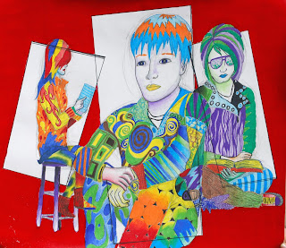
So far this project has been my absolute favorite. Again it's in the style of Peter Max, but it's a portrait. I chose to do a portrait of Becca (from my class) because I've never liked doing self-portraits. For me, it's more fun to try to protray other people and their personalities. I chose very bright, cheery, up-beat colors because that is the kind of personalitly Becca has. My favorite part of this piece is the high contrast and the way Becca's face is positioned.

This piece was done in the style of Peter Max and it was really fun for my because I love to draw people and create artwork about other people. I like how I got to use a lot of color and patterns. I'm still not crazy about the red in the back, and I almost think I should have left it white.

Souper Foods


I really liked the way my final product came out on this one. In my opinion it looks pretty professional, but I'm not completely crazy about the green in it. I wish I could have found a color that is more "soup-like", but it's much better than red which looks like blood. I also liked the trial and error process of the whole project, and seeing my progress untill the final product.

Tuesday, February 9, 2010

Altered Book page 1


This is the first entry that I did in my altered book. A lot of this was actually on accident because initally I wanted to do a scratch board effect but that totally failed. So i just scraped away the rest of the paint and pasted images on top. I like the way the background came out in the end though.